Daily Creates Week 6 – Data Visualization
For this week, since there was no data prompts on the Daily Creates website, I decided to do my own research to create data. The last time I’ve really created a graph was in grade 12 Calculus, where it was very complicated, so it was a nice chance to do it more light and easy. However, I learned a lot in our class about graphs, and data visualization is more intense than I had originally thought.
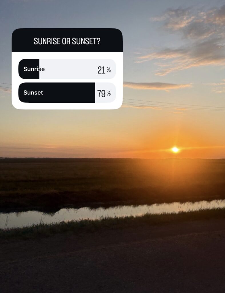
I had gotten my friends on my close friends Instagram story to answer my poll, asking if they preferred sunrise or sunset. As you can see, 79% liked sunset, while 21% liked sunrise better. I like this as you can see numbers, as well as a visual bar graph to see which was more popular.
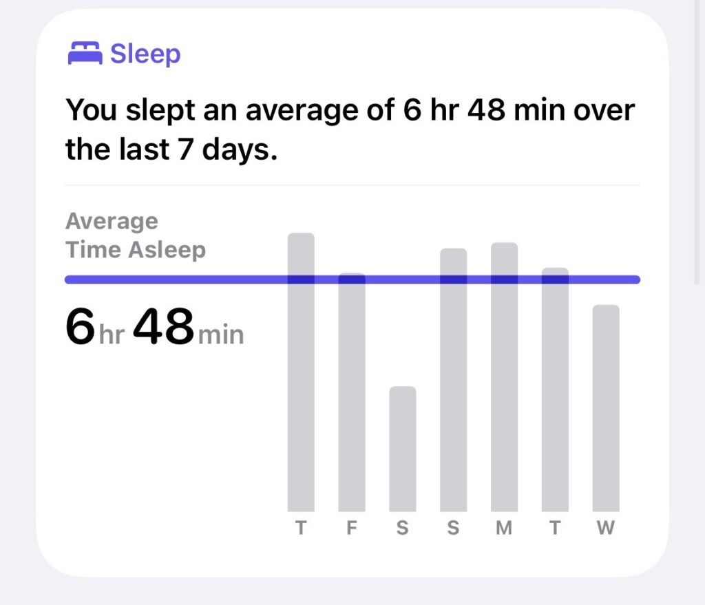
I have an Oura Ring, which tracks my data throughout the day and night. I have it synced to my Apple Health, which creates the weekly charts that are nice. Here, you can see the bar graph for my time asleep throughout the week, as well as my average sleep time, and how it compared to the graph.
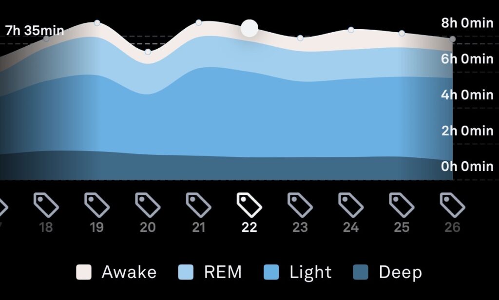
This is also data from my Oura Ring, which shows how much of my sleep each night was time awake, REM sleep, light sleep, and deep sleep. This chart is a stacked area chart, and I personally do not like it. It is interesting to look at, however for me, the data is hard to read, and woudn’t make sense from first glance.
Mayer’s Principles of Multimedia Learning
Redundancy Principle – With graphs, there is no redundant information, only the text which relates to what the graph is, and the graph alongside it. There is only graphic and text, not graphic, narraration and text, so learners are not overstimulated.
Coherence Principle – Each set of data is related to the topic that is being reported on, as well as the matching text. Graphs should be related to the topic, or else the data collection would be skewed. The explanation of the graph is also releveant to the data, to help provide guidance to someone viewing the graph.
Contiguity Principle – This principle refers to keeping labels next to diagrams, as it is more effective then spreading it apart. This is a key rule for data visualization, as the best graphs contain their data labelling the graph in the axes, so viewers know what they are looking at.